


Forma Na Szczyt is a distinctive brand in the outdoor, sport, and mountain industries that now boasts a new logo. The company is unrivaled in the market for its services and occupies a unique niche that is unknown to many. The company is unrivaled in the market for its services and occupies a unique niche that is unknown to many. Upon closer examination, the need for their services becomes clear. In short, if you want to climb Mount Everest or Mount Blanc, Forma Na Szczyt can help you achieve your goal. They also offer services for those preparing for marathons, ultramarathons, and climbing.
Karol, the leader of Forma Na Szczyt, approached me with a request to refresh and professionalize the logo, simplify it, and ensure its versatility across different fields. Despite the brand's focus on outdoor activities, most of its communication occurs online. While they do wear corporate outfits during trips like the Monte Rosa camp, they rely heavily on digital solutions. I proposed two color palettes and simplified the logo to an appropriate minimum. It is now grid-based and can be applied to both the typographic part and the symbol itself.
In this post, you can see how it may look in my mind regarding the graphic design of additional elements and the identity itself, for which I am partly responsible. As tomorrow is the weekend, I encourage you to spend it in nature, preferably in the mountains. Perhaps one day with that brand.


Introduction
Logobook is a prominent player in the realm of brand identity, creating a visual representation
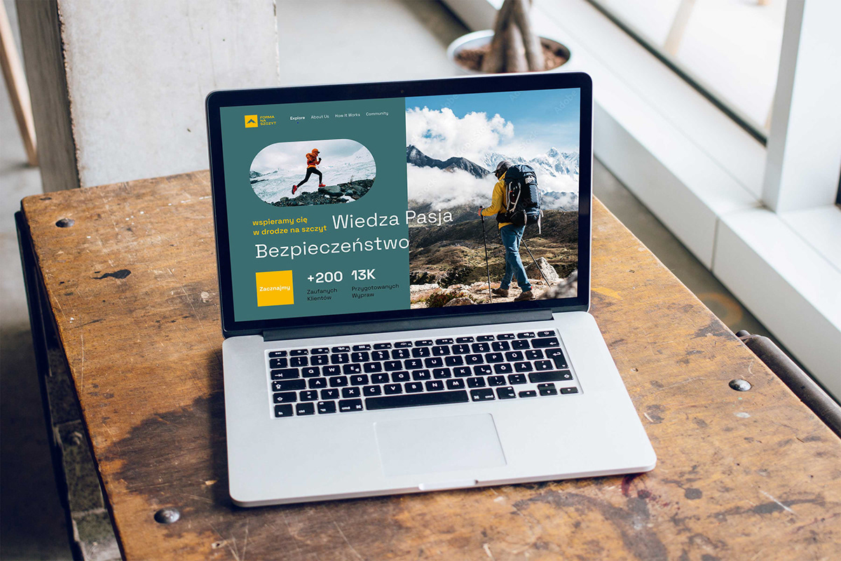
for Forma Na Szczyt, a unique provider of outdoor, sports, and mountain-related services. Forma Na Szczyt specializes in expedition preparation, offering training plans, dietary guides, and more. Their services are not limited to conquering well-known peaks like Mount Everest and Mount Blanc, but also extend to lesser-known areas. The brand's communication strategy centers on a unique logo and color scheme, which serve
as the foundation for conveying its essence.

Goals
1. Revamping the existing logo for Forma Na Szczyt to achieve a more professional and refined look.
2. Simplifying and optimizing the logo for versatile application across digital platforms and outdoor contexts.
3. Enhancing the visual representation to align with the unique and competitive nature of Forma Na Szczyt's services.

Challenges
1. Balancing the outdoor and digital aspects of Forma Na Szczyt's brand communication.
2. Meeting the need for simplicity and professionalism while maintaining the uniqueness of the logo.
3. Adapting the logo to various use cases, including digital platforms and outdoor events.
2. Meeting the need for simplicity and professionalism while maintaining the uniqueness of the logo.
3. Adapting the logo to various use cases, including digital platforms and outdoor events.

Results
1. Redesigned and simplified logo with a focus on professional application.
2. Integration of the logo with two distinct color palettes suitable for both digital and outdoor contexts.
3. Implementation of a grid-based structure for the logo, allowing easy application with typographic elements and as a standalone symbol.
2. Integration of the logo with two distinct color palettes suitable for both digital and outdoor contexts.
3. Implementation of a grid-based structure for the logo, allowing easy application with typographic elements and as a standalone symbol.


Thank you!
Kamilowany design – It is my personal brand, I'm a multidisciplinary one-man army.
Stay tuned, follow me on Instagram: @kamilowany_design


